Screen Design
Screen Design allows users to configure the layout of Gold-Vision screens. Selecting the Screen Design option from the User Interface menu will open a list of the configurable items. The list will also display any items that are currently being configured and indicate the user currently editing the object.
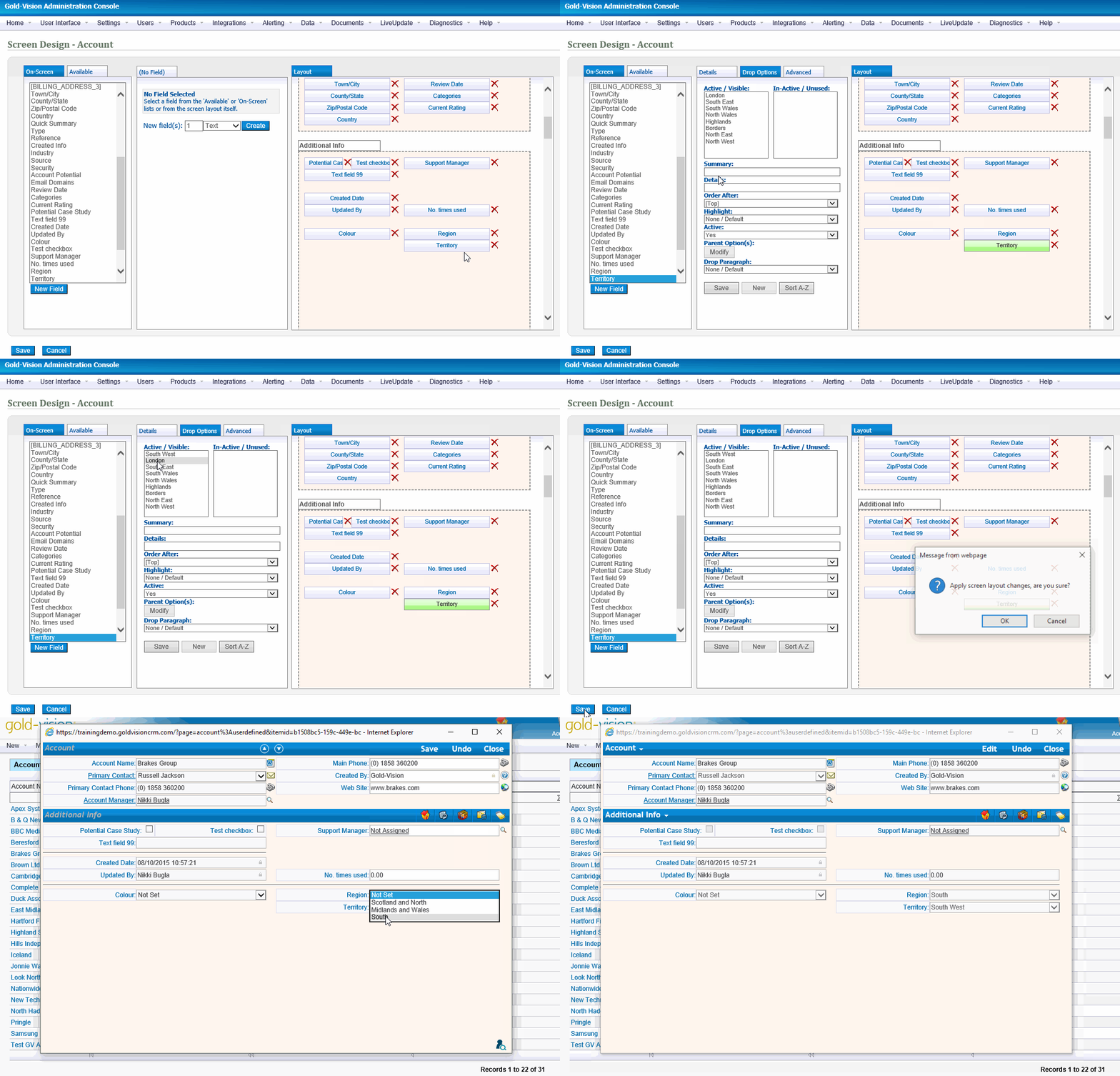
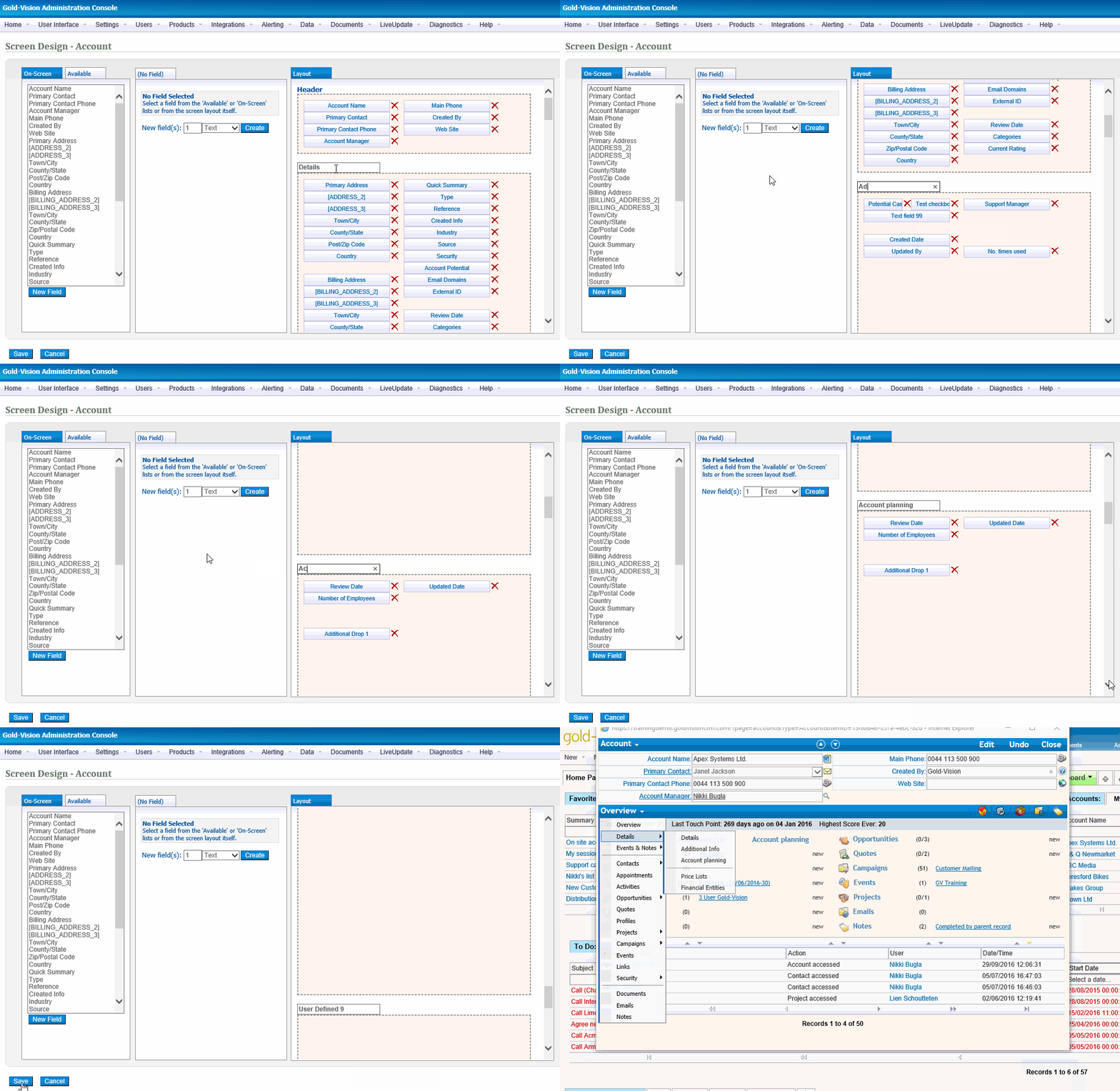
To design an item, just click its name in the list. The example below highlights the layout of the default Account screen within the screen designer. The user defined sections of the screen are visible by scrolling down the screen layout section on the right hand side.

Editing the screen design
Fields available - the following types of fields can be added: text fields, drop down fields, numeric fields, date fields and check boxes
Adding fields from the available list
Add additional fields to the screen by clicking on the appropriate field from the Available list and clicking on a free space on the screen layout area
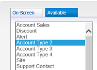
To add a field to the screen click on an empty location on the layout screen sections to the right.
Removing existing fields from screen design
To remove an existing field simply click the red cross on the right hand side of each field. This will result in a prompt to confirm the removal. The field will be returned to the bottom of the available list.

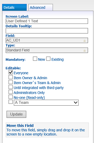
Configuring fields from the field details section
Use the details section to configure the new field:
Configuring Dropdowns

Standard Drop Downs
In addition to the existing text field options, dropdown fields allows users to set the drop options for that field, as well as being able to define parent dropdowns (i.e. where the drop options in this field are dependent on drop selections made from the parent dropdown).
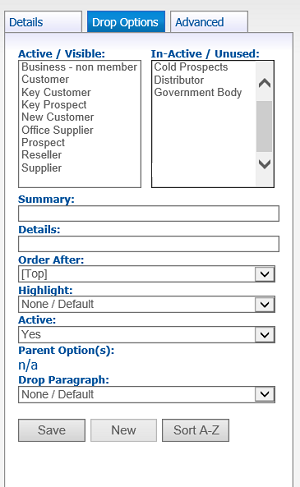
Summary - name of the drop option.
Details - Allows users to record what the field represents. Note this will not be displayed to the user.
Order After - Set the order the drop options appear.
Highlight - set a colour for the drop option from the wide range of available colours.
Active - if set to yes the dropdown will be visible from the dropdown list. The current status can be viewed from the Active and In-Active boxes.
Parent Option(s) - (see also below) if the drop down field has been assigned a Parent dropdown, then for each dropdown, indicate which Parent option would make this option valid. In the example above, if we were setting the dropdown "Option 5" in Dropdown 2, then this field would be set as "Product B"
Drop Paragraph(s) - (see also documents section). Gold-Vision allows you to construct template documents using paragraphs that link to dropdown options. For example, you may have an introductory letter template document that you change depending on, say the industry of the recipient. You may construct the relevant paragraphs that are relevant for the different industries, and then Gold-Vision will insert the relevant paragraph into the document based on the industry dropdown if they have been linked.
Sort A-Z - arrange in alphabetical order.
Click the Add button to confirm additional drop option. Note the dropdown selection will not be removed from existing records with this option selected.

Special Dropdowns
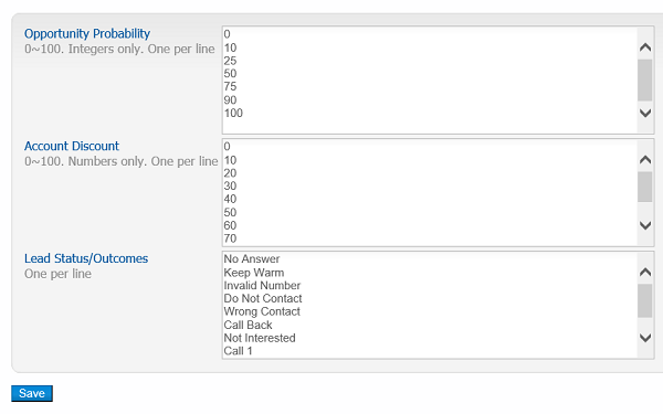
A few of Gold-Vision's drop down fields contain special or restricted values. These can be configured below.
Configuring Parent Dropdowns
A dropdown can have a parent and child relationship. For example: Regions and Territories:
| Region - Parent Drop |
Territory - Child Drop Options |
| Scotland and North |
Highlands
Borders
North East
North West
|
| Midlands and Wales |
North Wales
South Wales
East Midlands
West Midlands |
| South |
South East
South West
London |


Drop Paragraphs
Gold-Vision allows you to create template documents using paragraphs that link to dropdown options. For example,in a Quote you may have payment options for different customers. You can create the relevant paragraphs that are relevant for the different payment terms eg Cash, 30 days, 60 days, and then Gold-Vision will insert the relevant paragraph into the document based on the payment term selected.
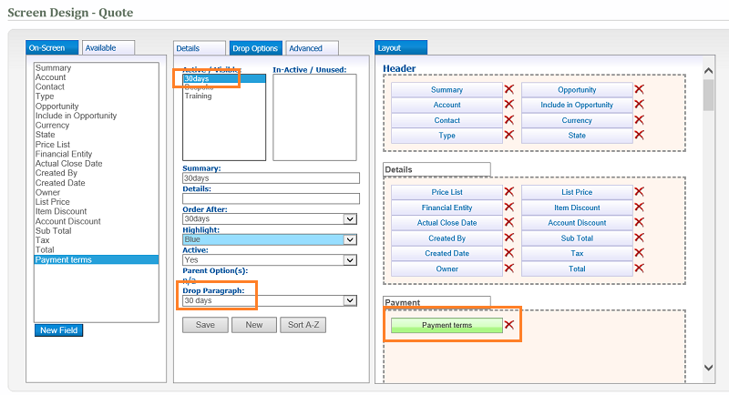
The template tag can then be added to a template in the format <P:fieldname>
In the above example the field name for Payment Terms is OPQ_UD1_ID. To output this in a document template use the standard tag in the following format: <P:OPQ_UD1_ID>
See Templates for more information about creating Templates

If you find that there are not enough user defined fields available additional fields can be added as follows:
With no field selected, the following should be visible in the middle pane, select the type of field you wish to create and click the 'Create Field' button. The screen designer will reload, the field will be visible at the bottom of the 'Available Fields' list and can be added to your screen and edited in the usual way.
Most items have 10 additional user defined pages available for you to customise and place fields on. A page will only appear for navigating to in the user interface if it has fields added to the screen design on it.


